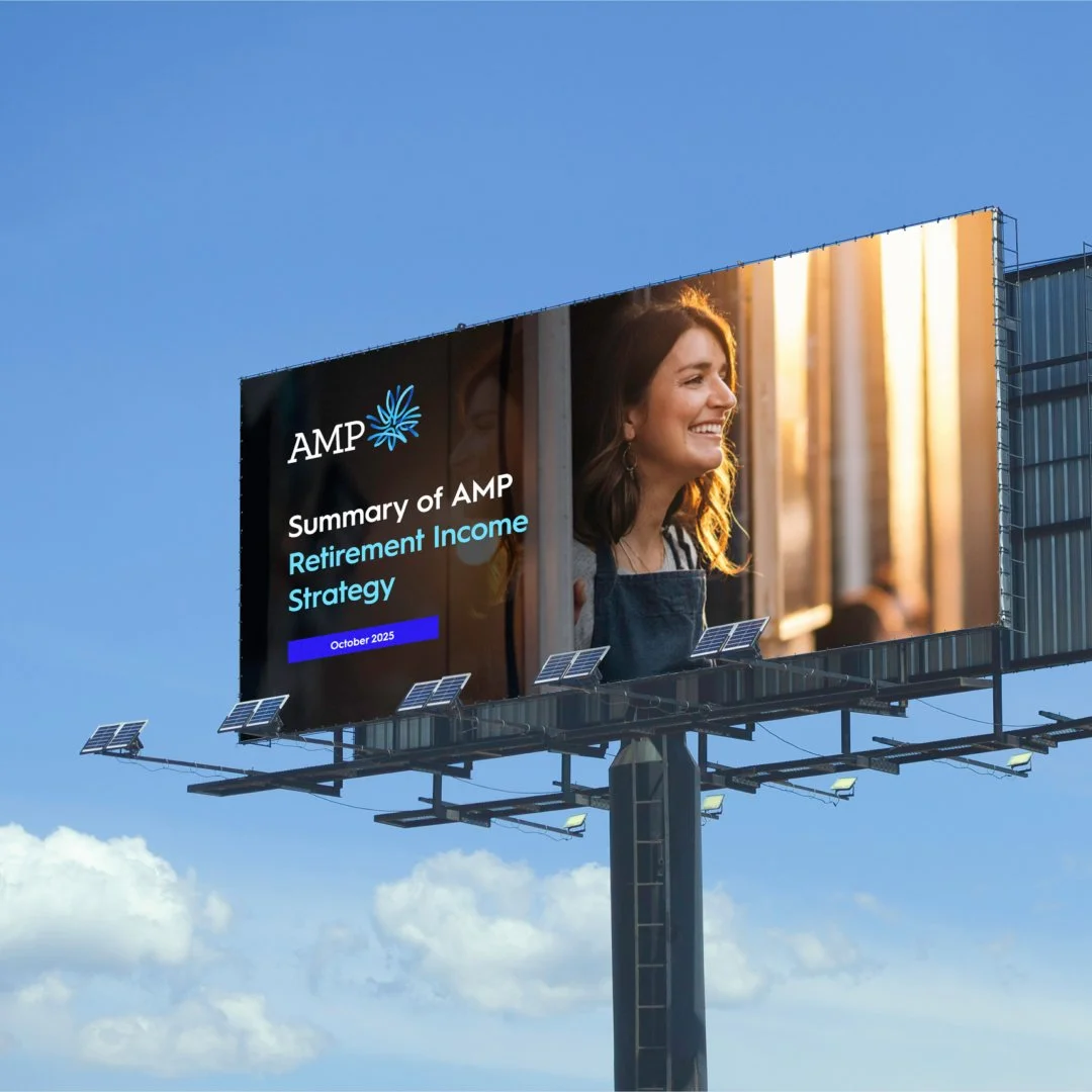
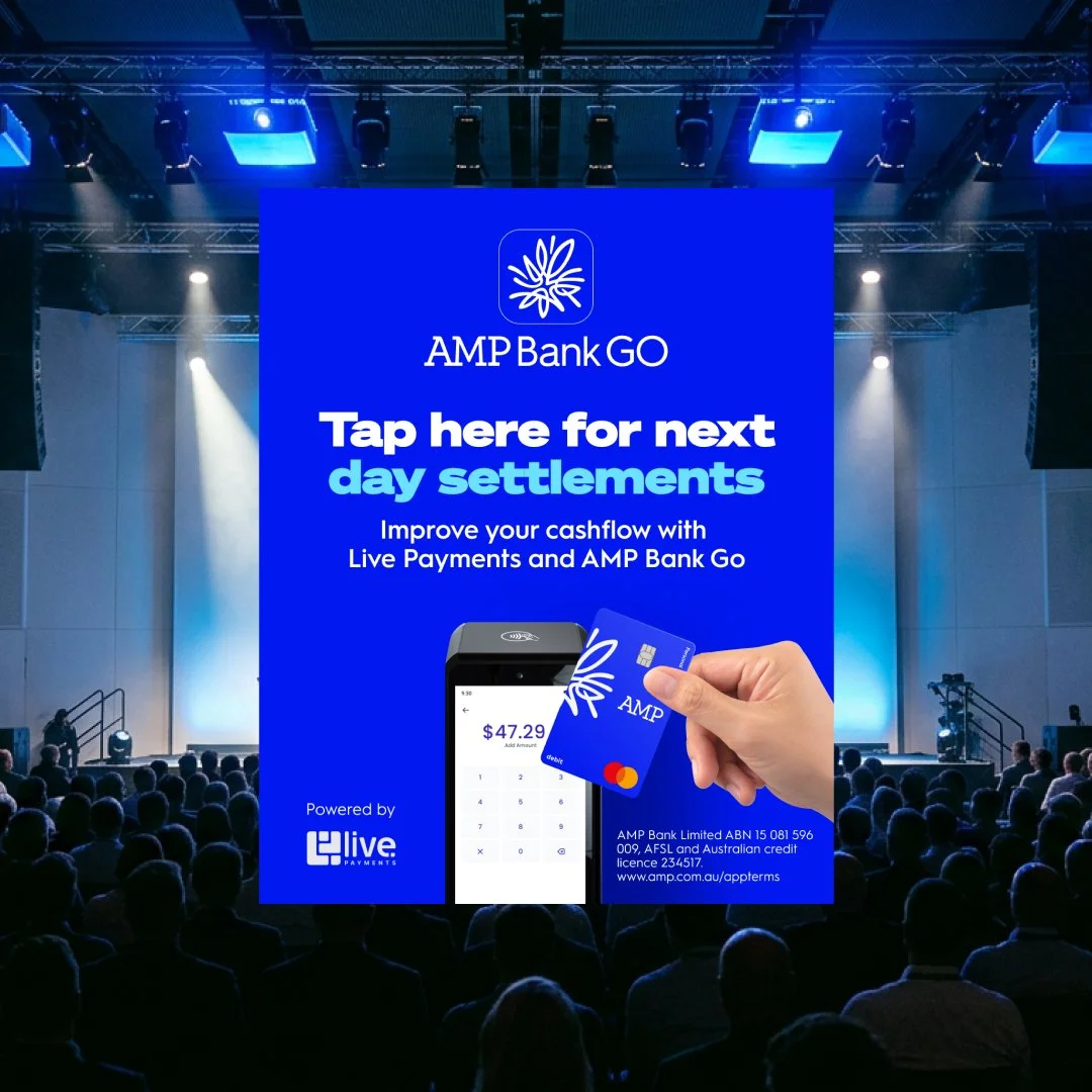
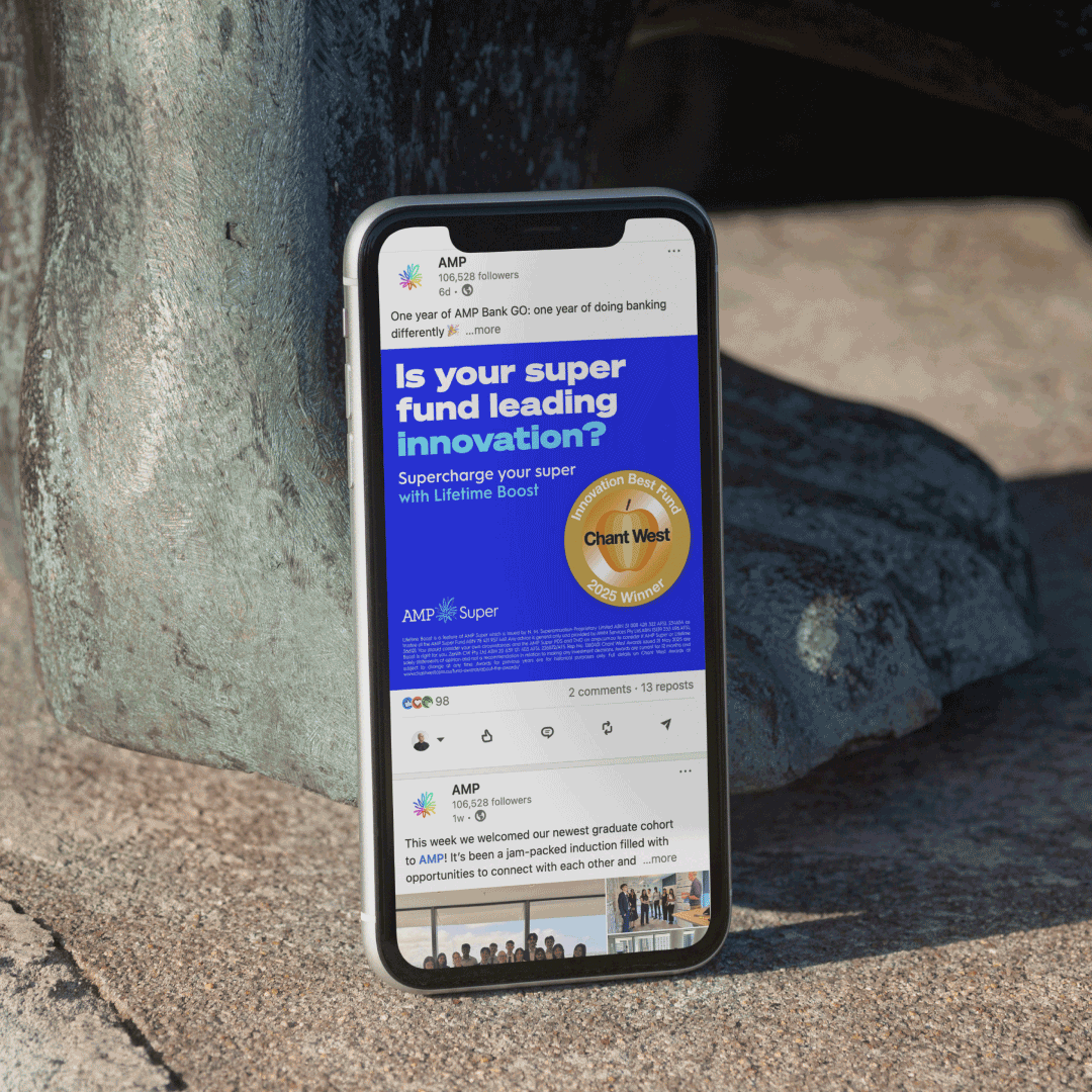
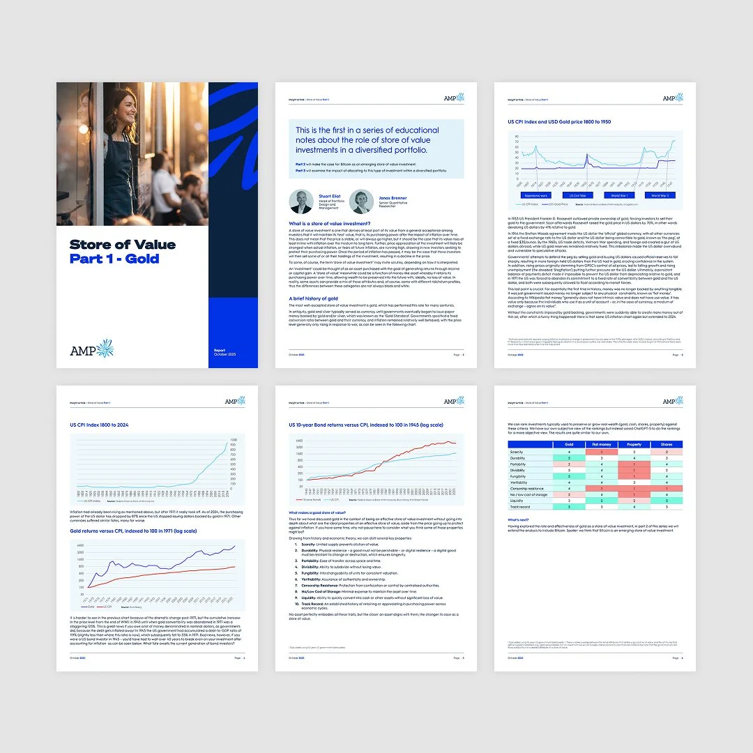
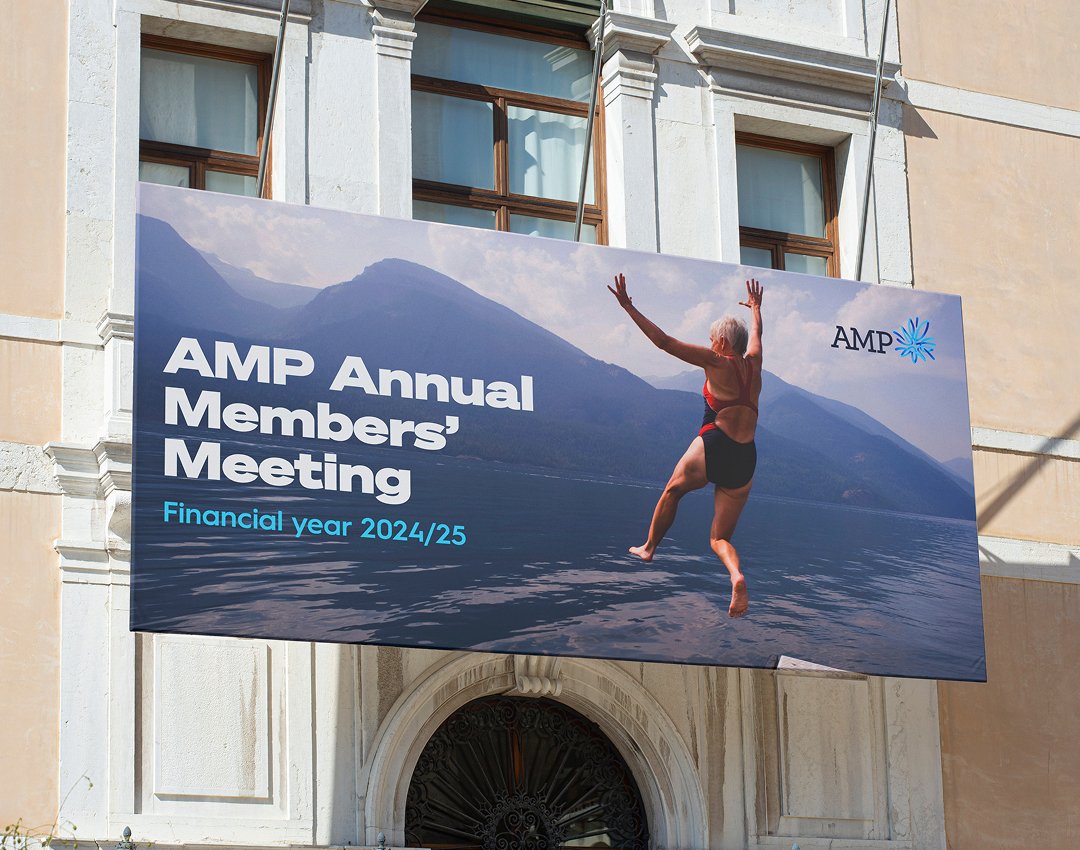
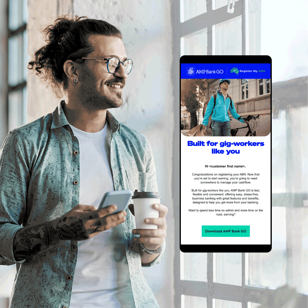
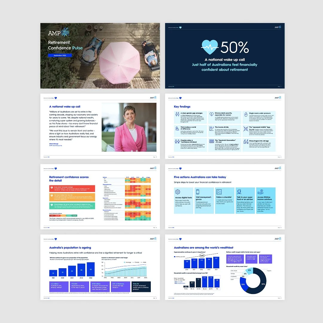
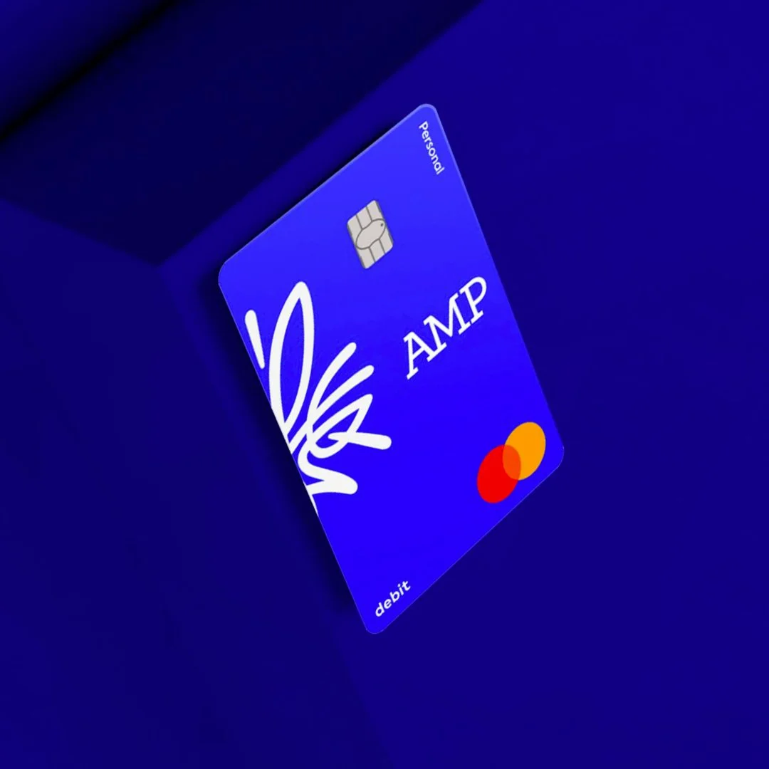
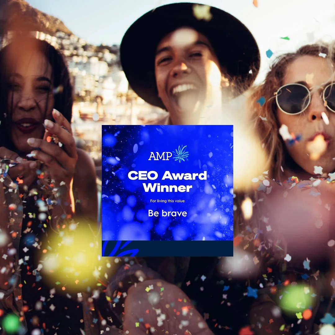
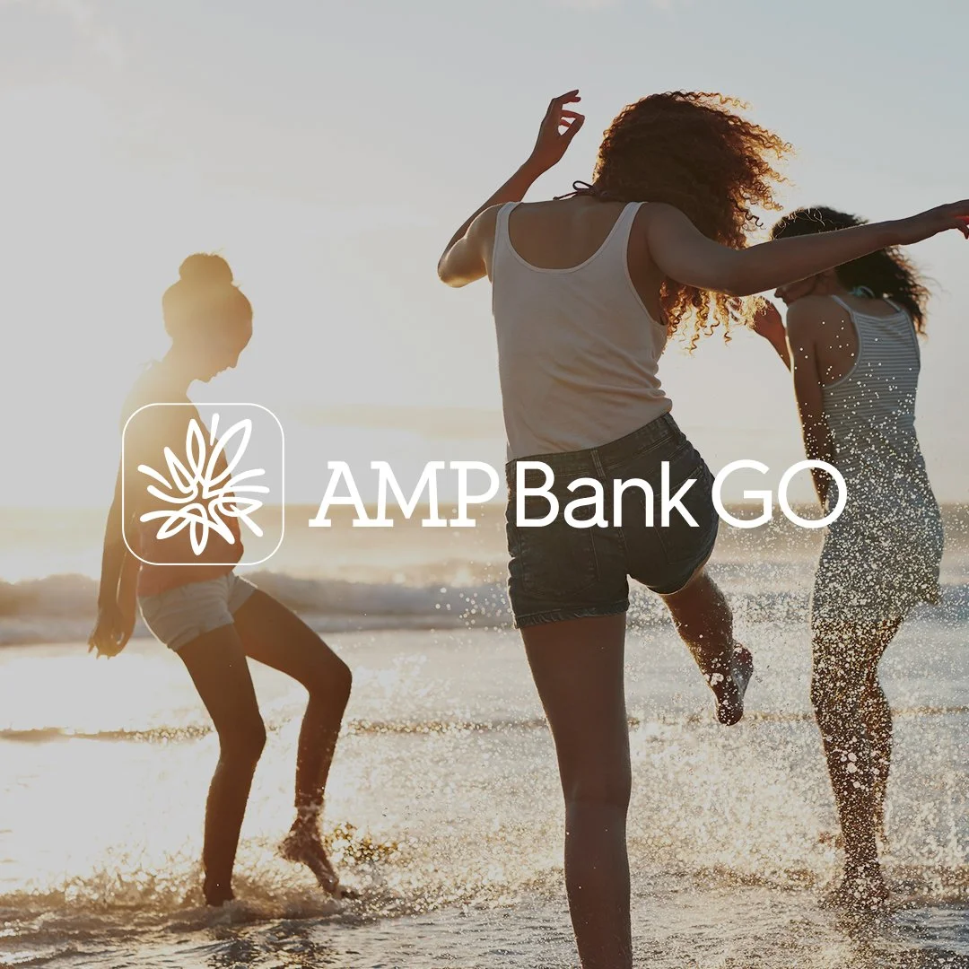
AMP Superannuation and Banking
AMP Limited, originally the Australian Mutual Provident Society, is one of Australia’s leading financial services companies with a 175-year history. Founded in 1849 as a life insurance provider, AMP now supports over one million customers across Australia and New Zealand with banking, investments, and retirement planning.
Brief
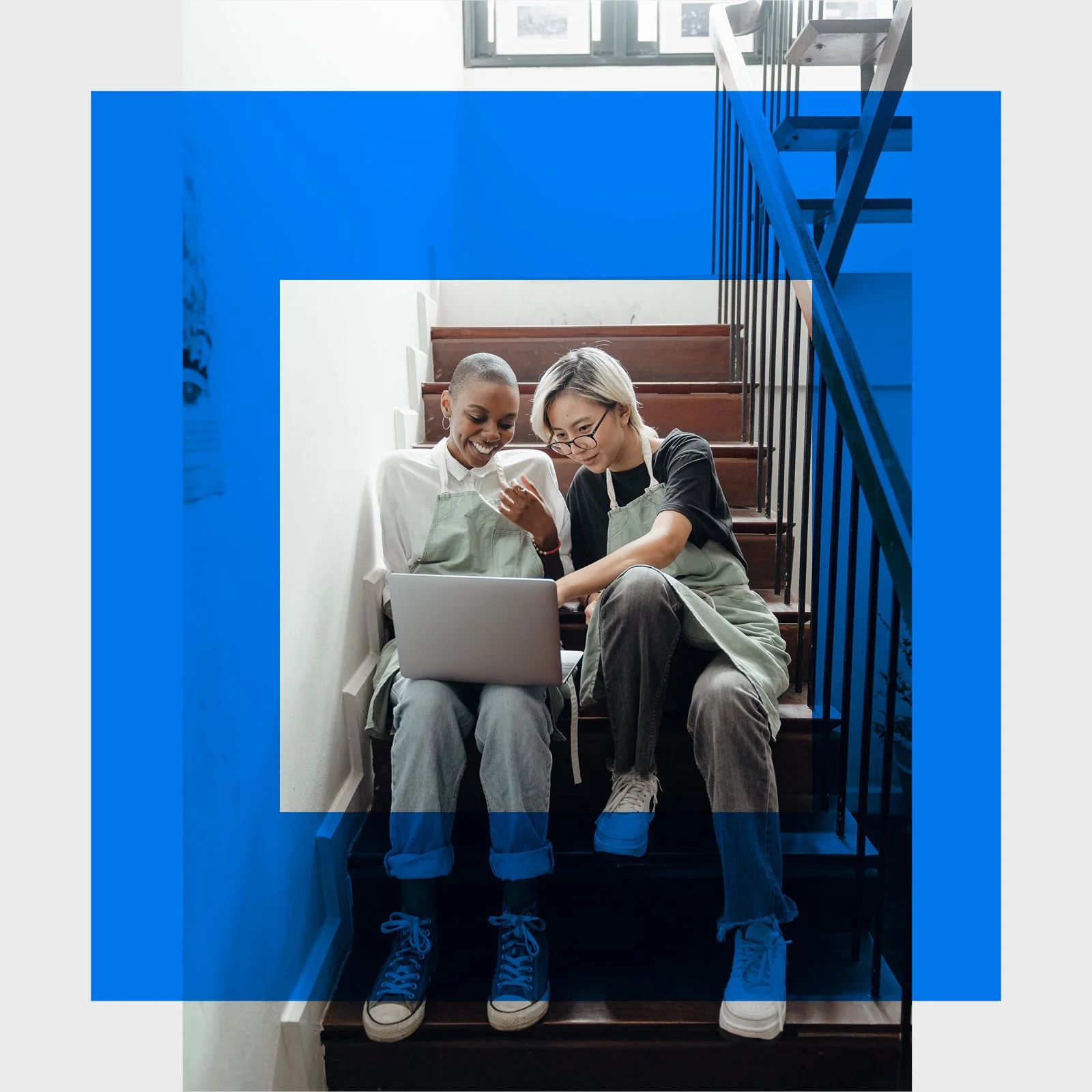
Evolve and elevate the AMP brand across multiple channels while maintaining strong visual consistency. The challenge was to balance creativity with brand discipline—delivering work that felt contemporary and distinctive while staying aligned with established guidelines.
Work spanned both B2B and B2C communications, from corporate collateral to national out-of-home (OOH) campaigns. The focus was on translating brand strategy into clear, engaging visual communication.
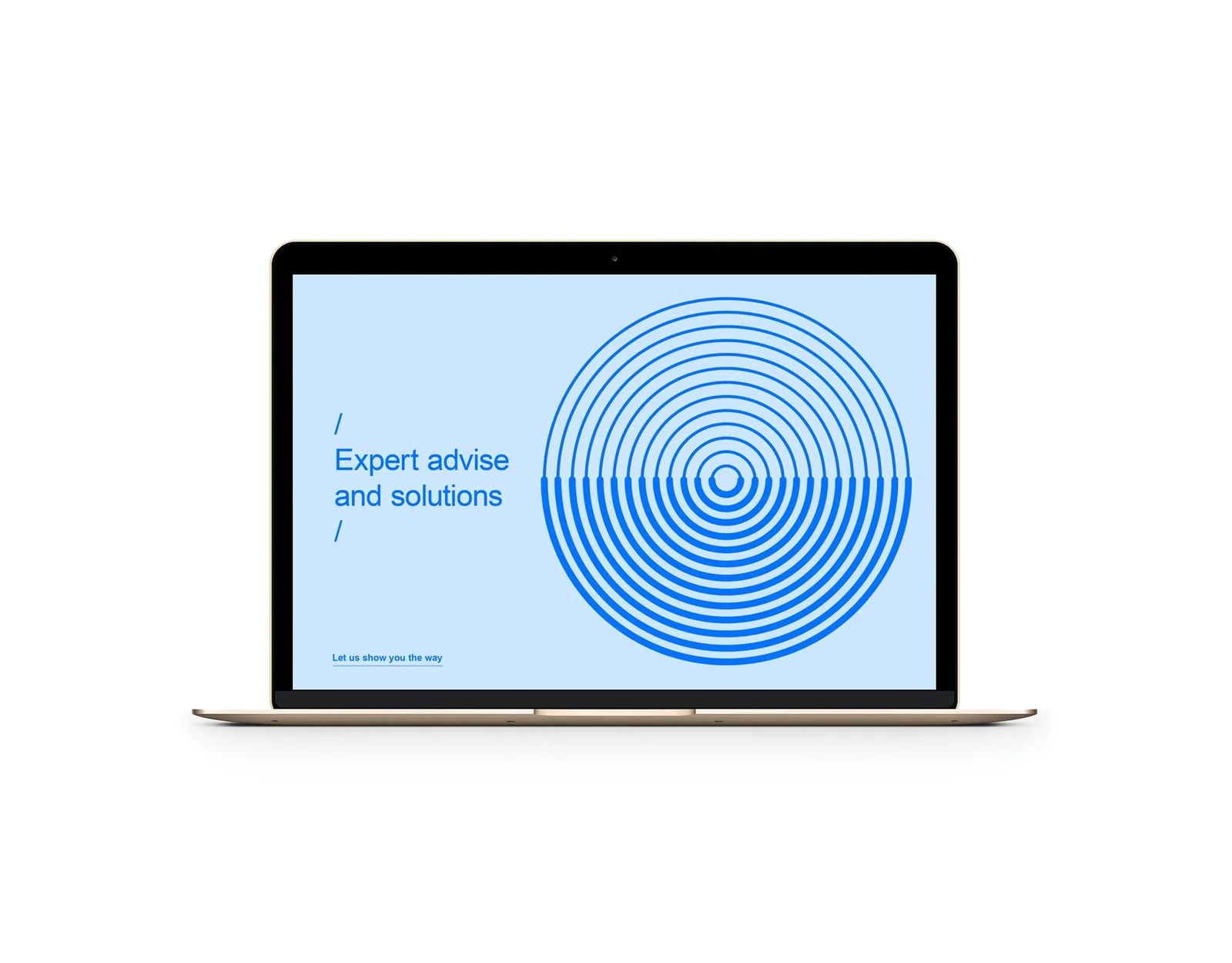
Process
Using the existing logo and brand guidelines as a foundation, I developed a flexible design system that supported a wide range of print and digital outputs. This allowed campaigns to be rolled out consistently across channels while maintaining a cohesive brand presence.
Services
Brand Design Direction, Art Direction, Brand System Design
It was an honor to work with this development of the strategic repositioning from where is started to how it is still transforming into the future for Latrobe City.
Brief
Appointed by Creative Agency Cyclone to lead the branding design for the client of Latrobe City Council. Including the creating of separate identities for the architecture of its four pillars: Live, Work, Invest and Visit.
Process
Extensive design research was taken on to come up with a mark that would stand strong and highlight are and the theme of ‘Life Transformed’. The graphical element was developed to be big and bold in all uses and be a strong mark that was easily recognisable. Colour palettes have been created to work independently for the primary branding. While also complimenting the four brand pillars. Special consideration was taken to not resemble other regional council areas that were competing for regional tourism business.
Services
Branding Design. Brand Positioning. Art Direction
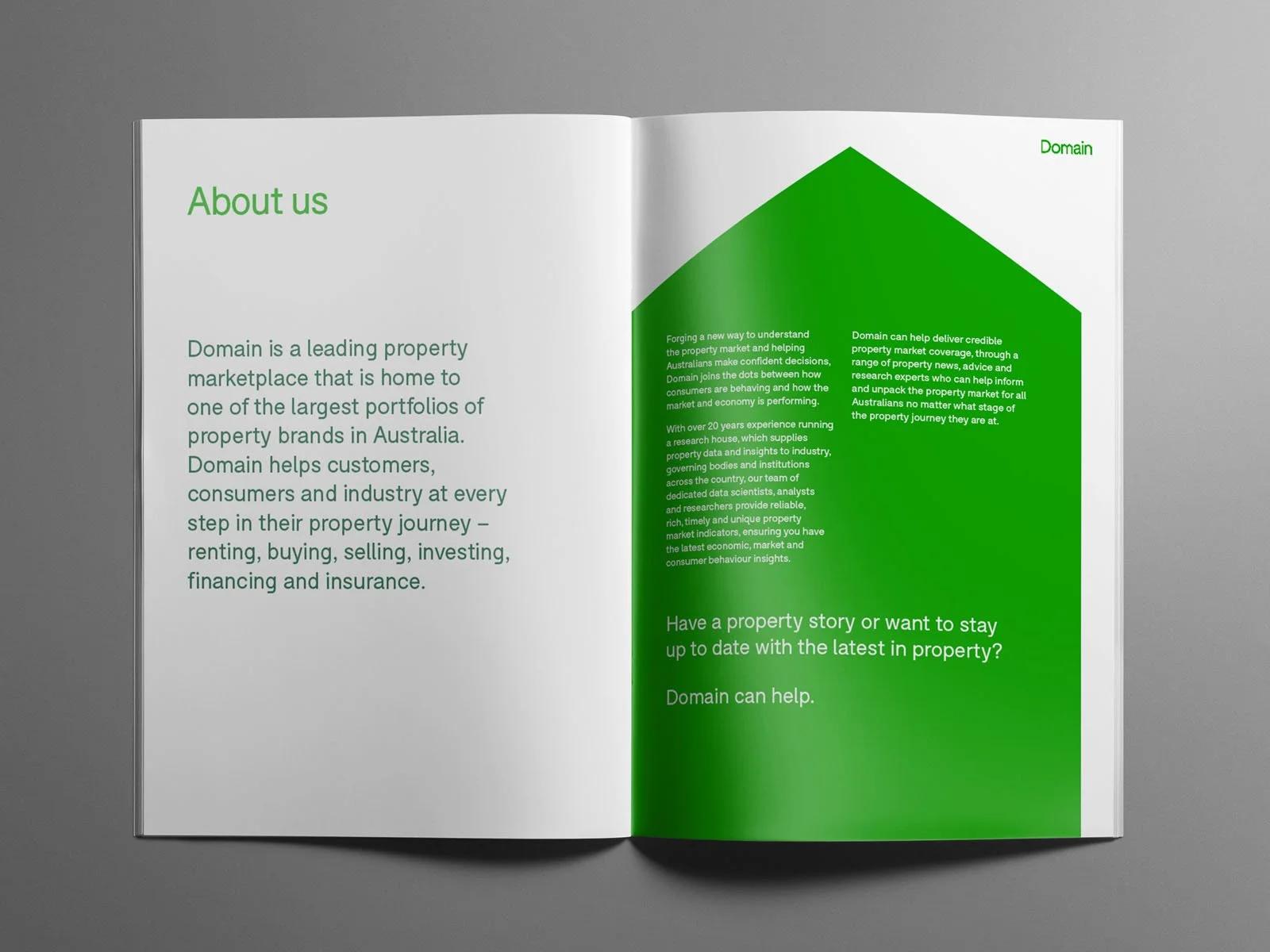
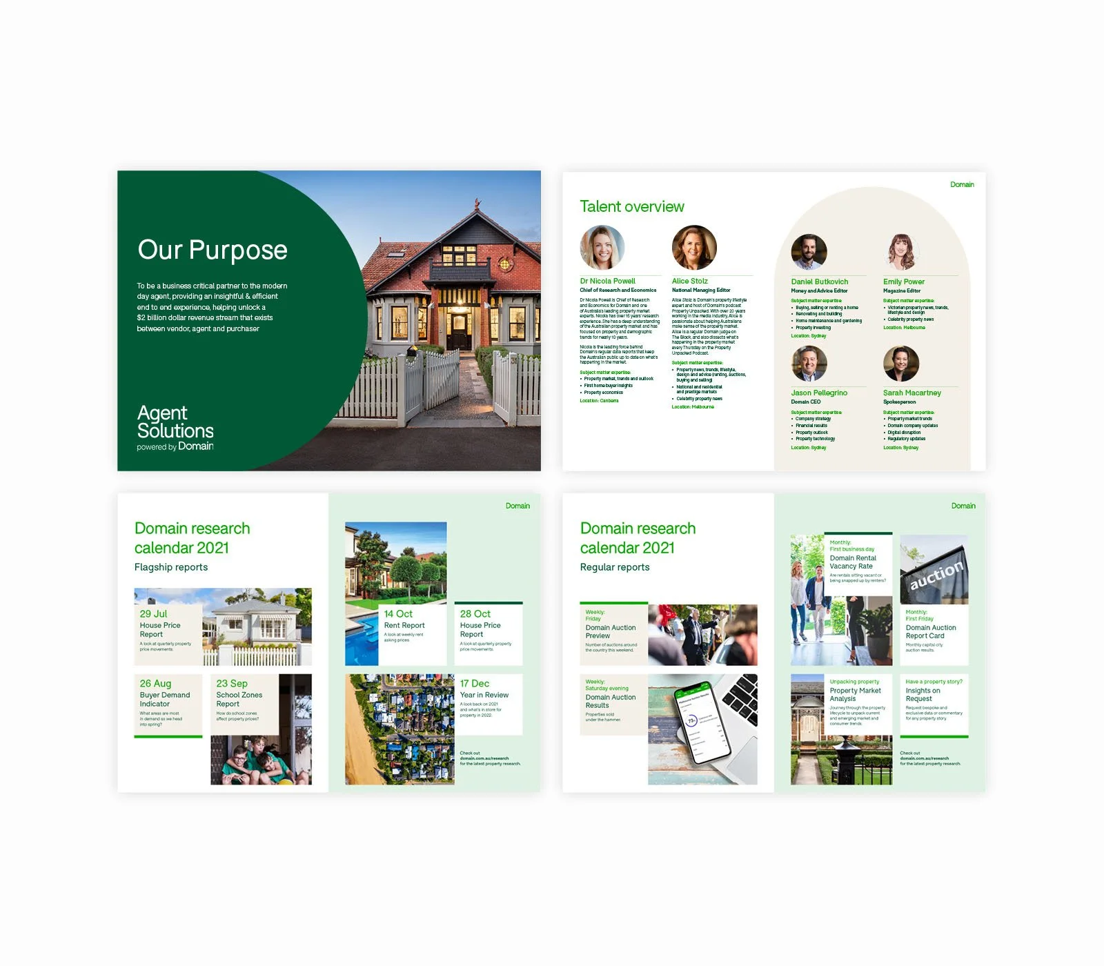
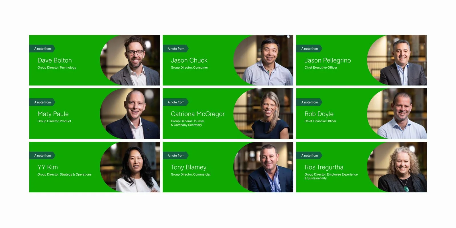
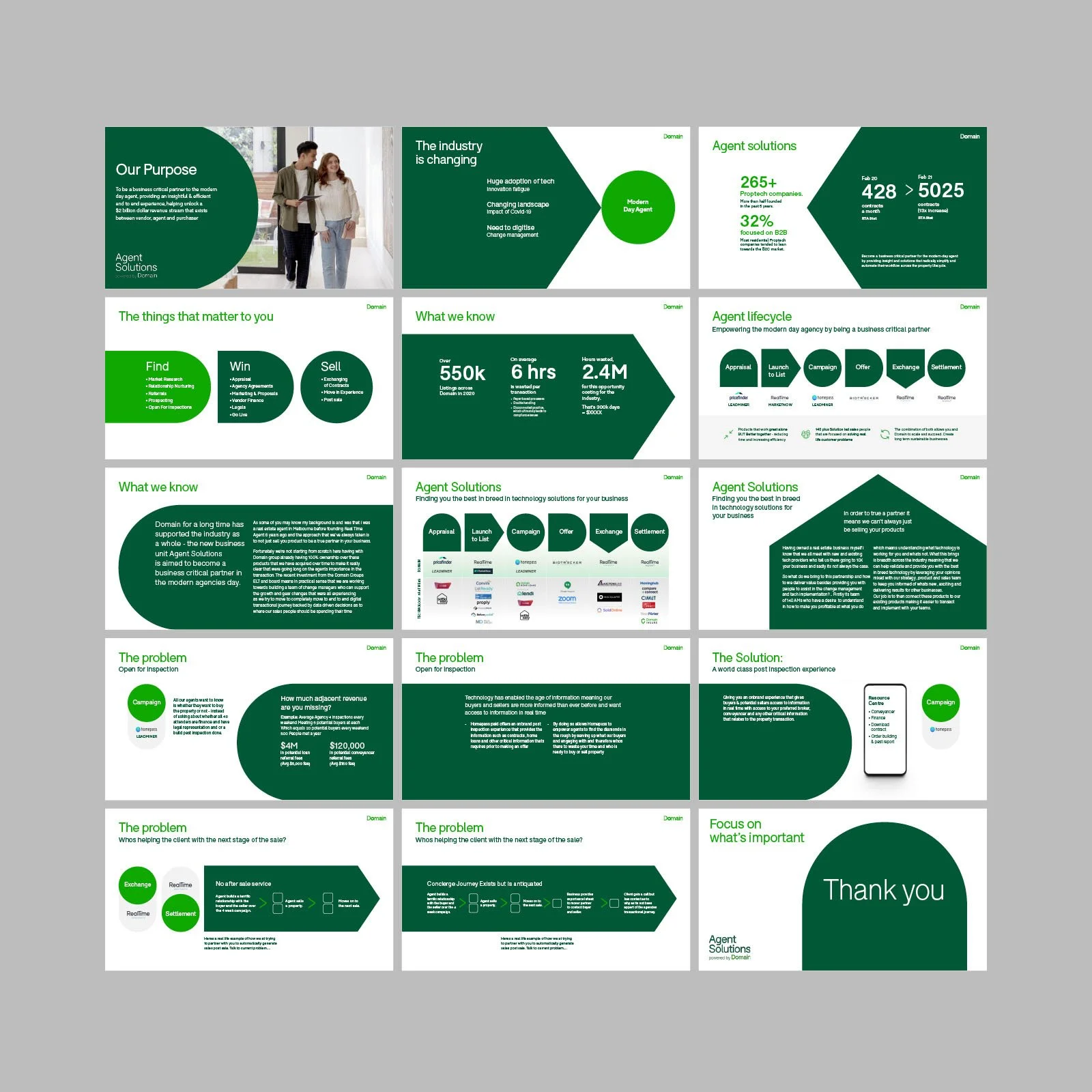
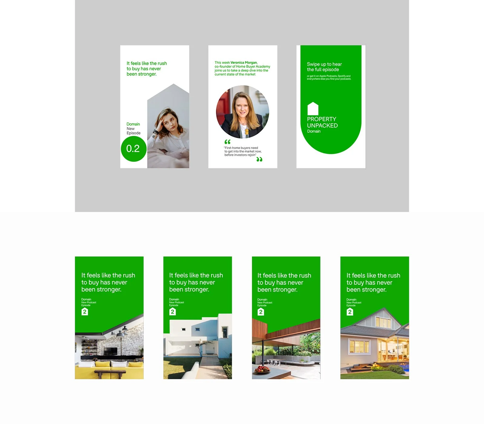
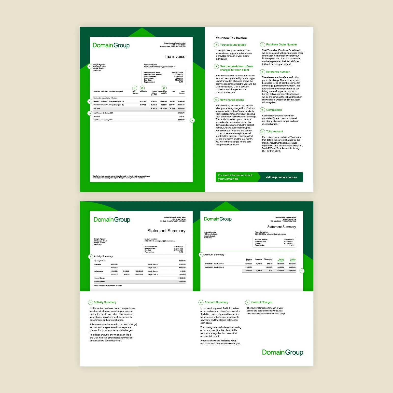
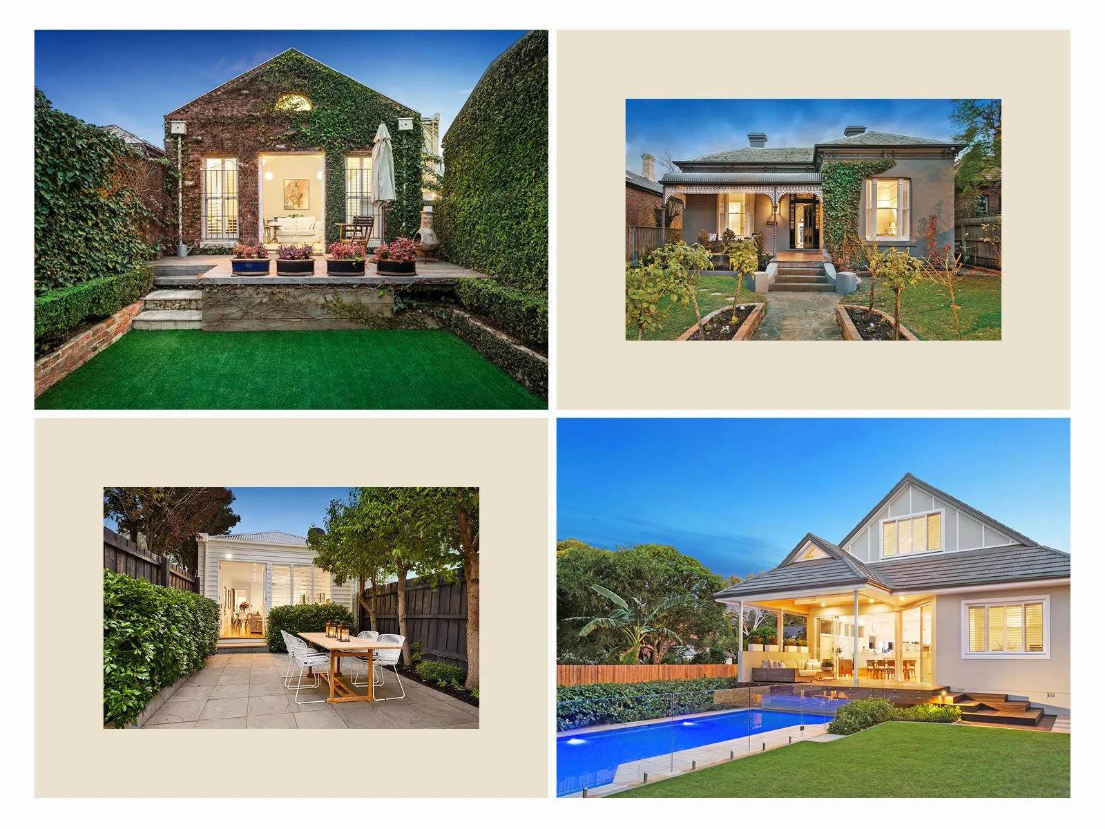
Domain is a leading property technology and services business that has one of the largest portfolios of property brands in Australia. Helping agents and consumers in the property life cycle – renting, buying, selling, investing, financing and insurance.
Brief
Branding and creative for B2B and B2C including day to day corporate communications to national OOH Campaigns. Brand adaptation and development of the design system across multiple roll outs while keeping to very strict guidelines to ensure the iconic brand was always sophisticated, clean and functional.
Process
Developing a design system for templates and various communications using the family of brand elements while making everything functional and used simple yet effective design principles.
Services
Art Direction. Design. Illustration. Finished Art.
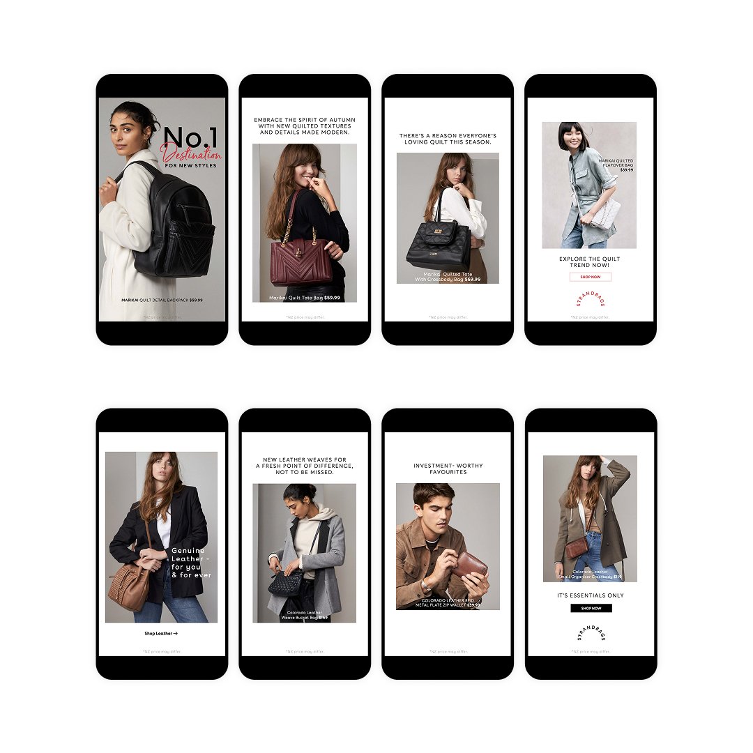
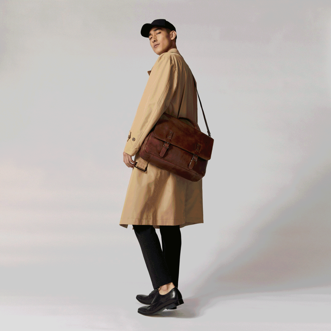
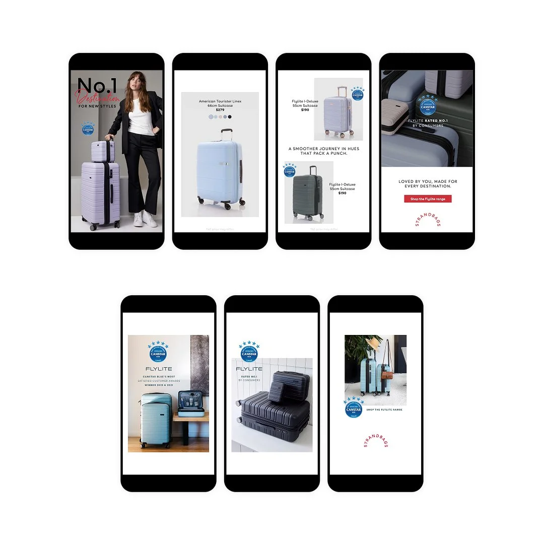
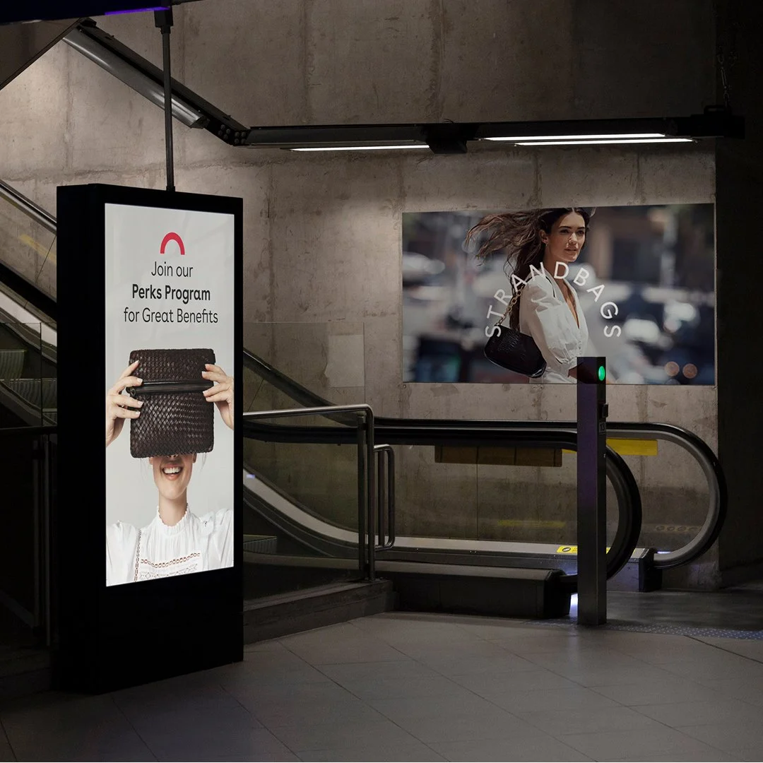
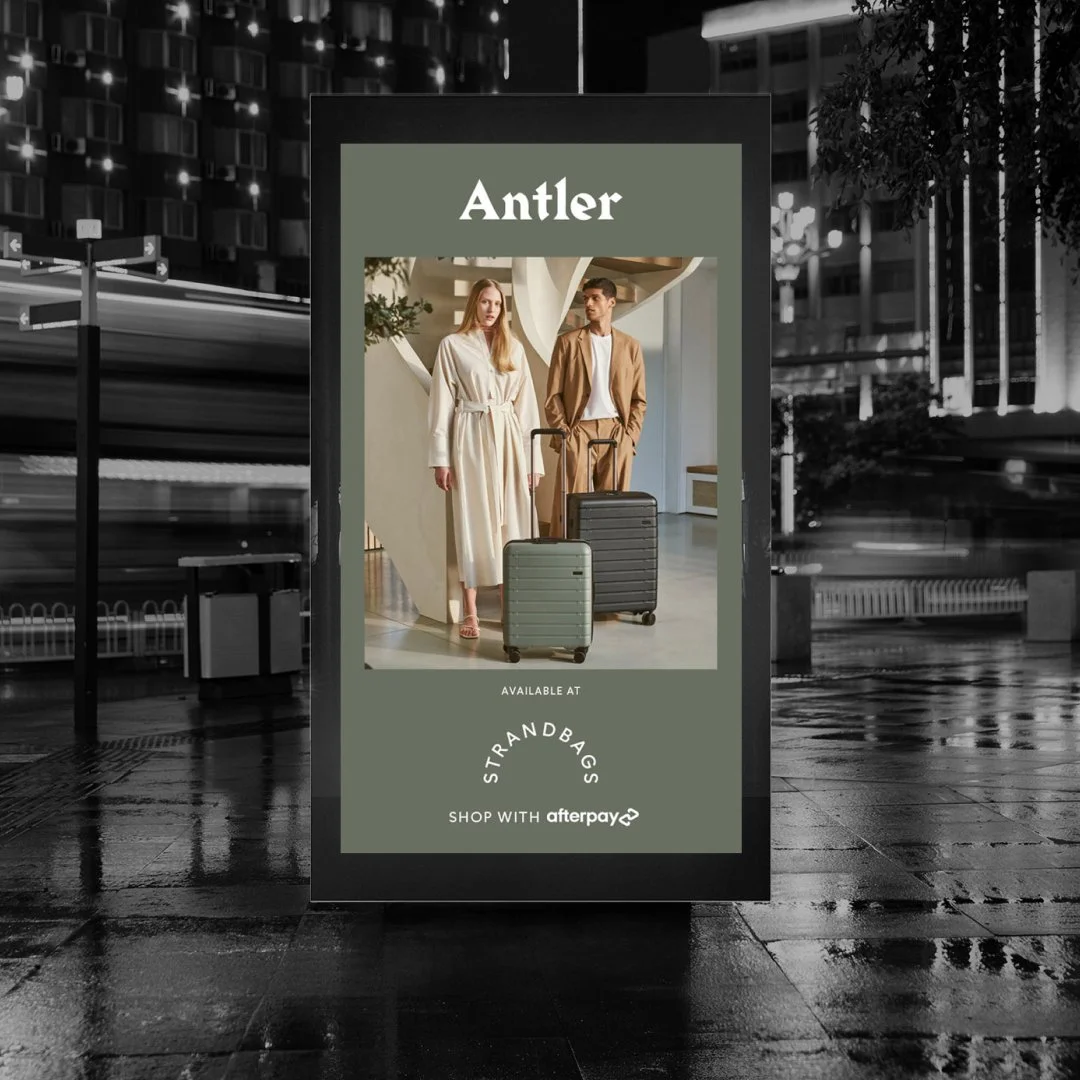
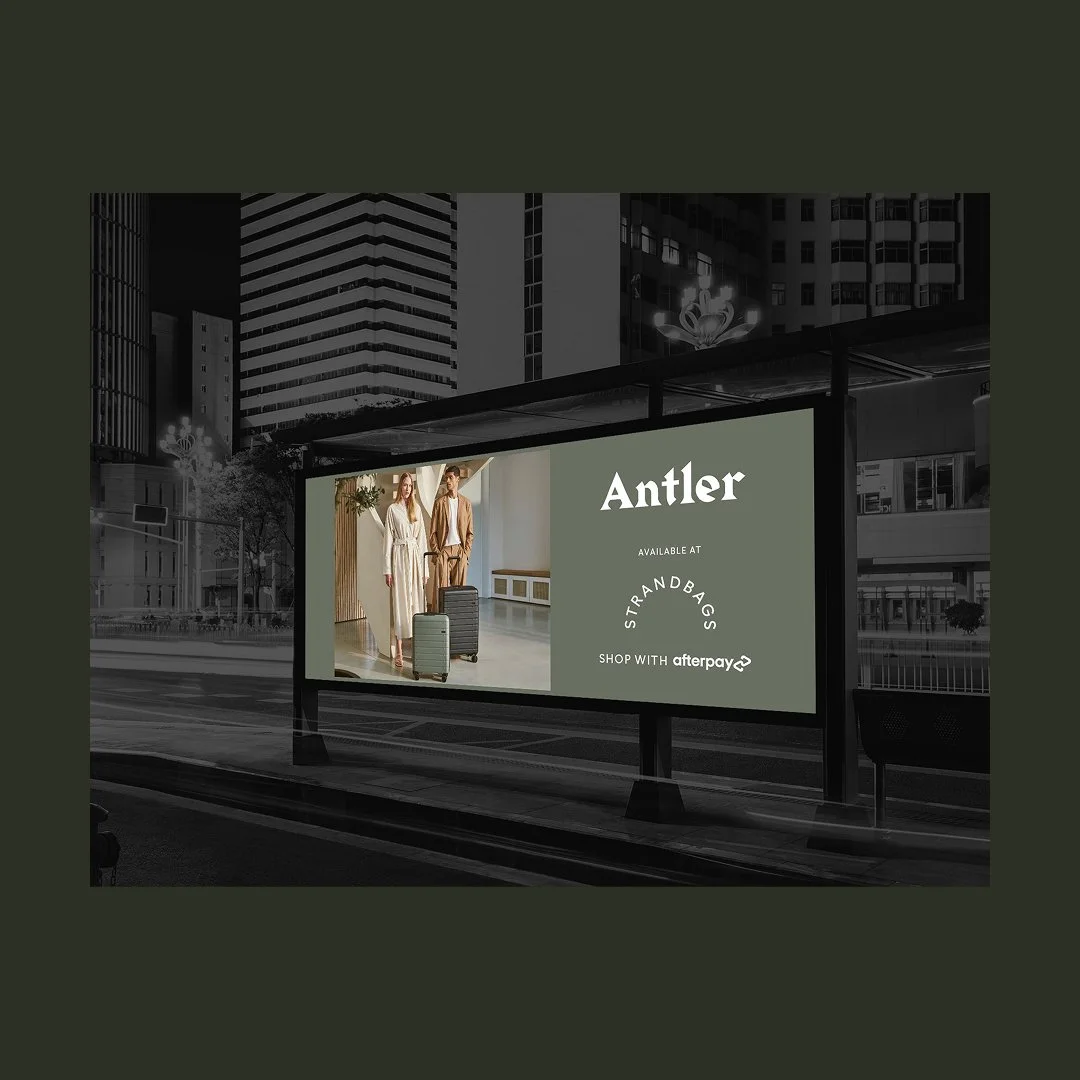
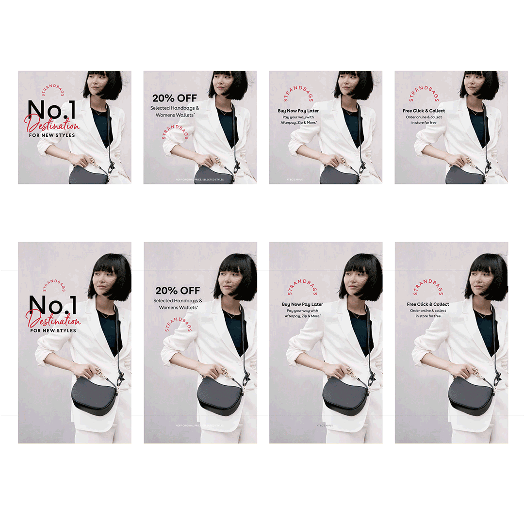
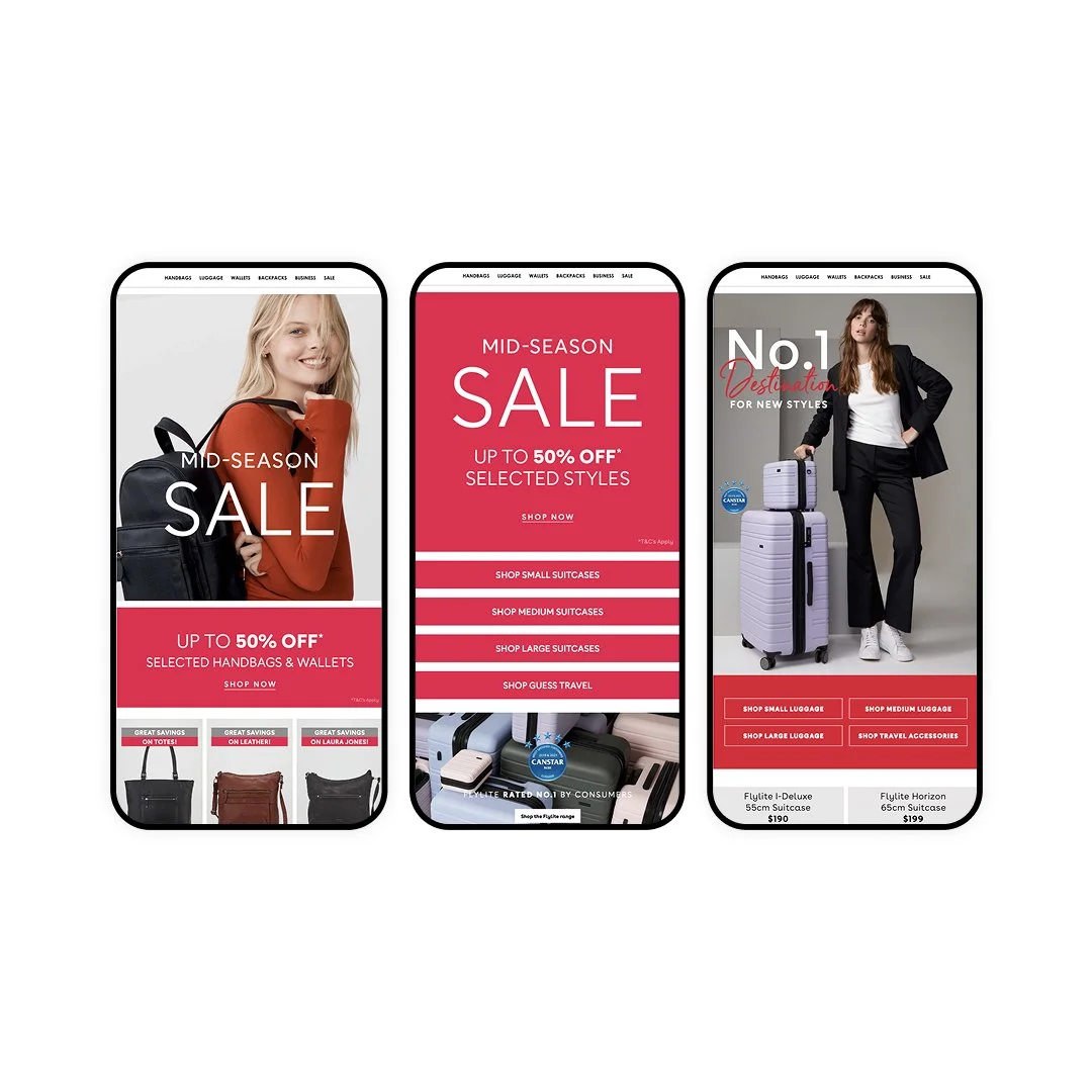
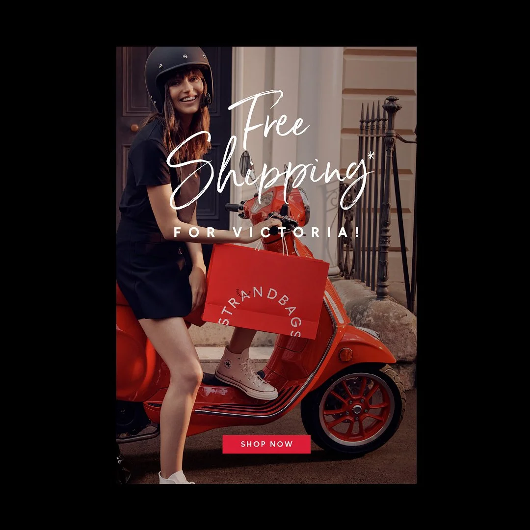
The House of Fashion Travel, going places
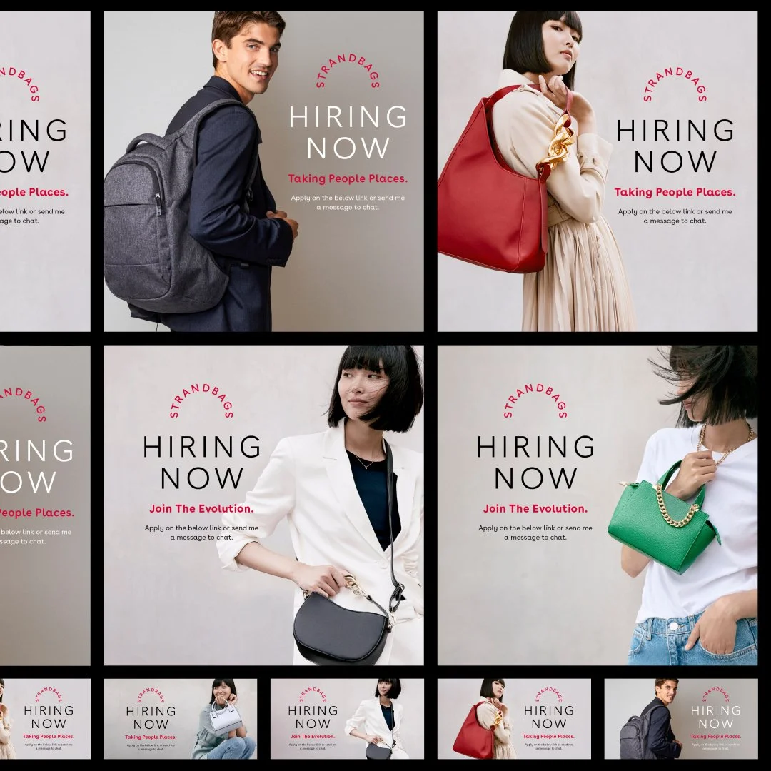
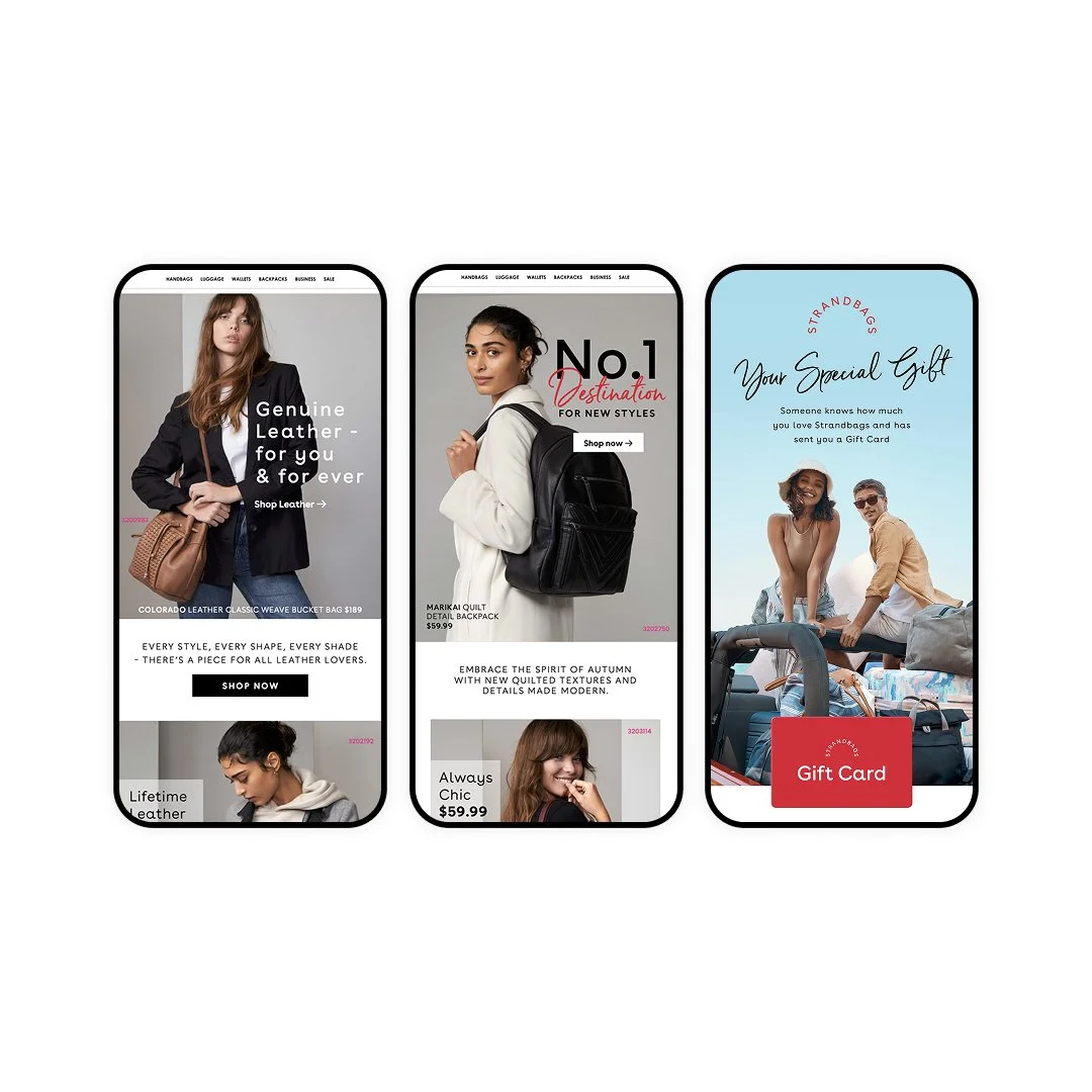
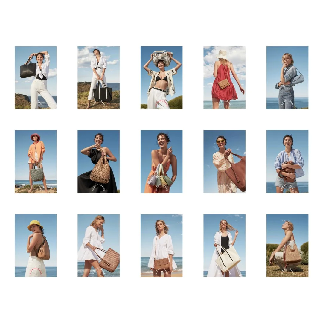
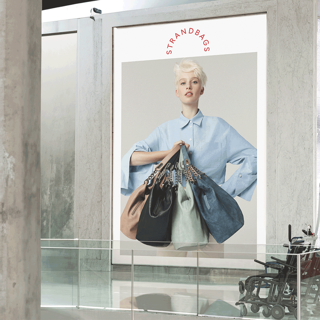
With a heritage dating back to 1927, Strand has long been a staple of the Australian retail landscape, offering luggage, handbags and travel essentials through a network of more than 300 stores across Australia and New Zealand. In 2022, the brand embarked on a significant evolution—reintroducing itself simply as Strand.
The rebrand signalled a shift toward a more modern retail experience, with elevated store environments and a renewed focus on its growing private label portfolio, including Nere and Evity.
Brief
As the business repositioned for a new era, I helped define the visual expression of the updated identity—transforming an outdated look into a more contemporary and elevated brand experience.
A strong emphasis on art-directed, high-quality photography brought a premium feel to the creative, which was developed into multiple campaign executions across OOH, retail signage, and point-of-sale environments.
Process
Building on the established logo guidelines, I translated the visual direction into a flexible and scalable design system that supported a broad range of deliverables across both print and digital platforms. A key focus of the work was modernising the overall brand experience and repositioning the brand perception to feel more premium, contemporary, and relevant for today’s audience.
The refreshed visual framework enabled creative campaigns to be adapted and deployed consistently across channels, ensuring a seamless brand presence while strengthening audience engagement. As part of a broader transformation, there was also an opportunity to reimagine the website, evolve the overall look and feel, and enhance the in-store experience—placing greater emphasis on a more refined, stylish, and modern retail expression.
Services
Branding Design Direction. Art Direction. Designing Branding Systems.
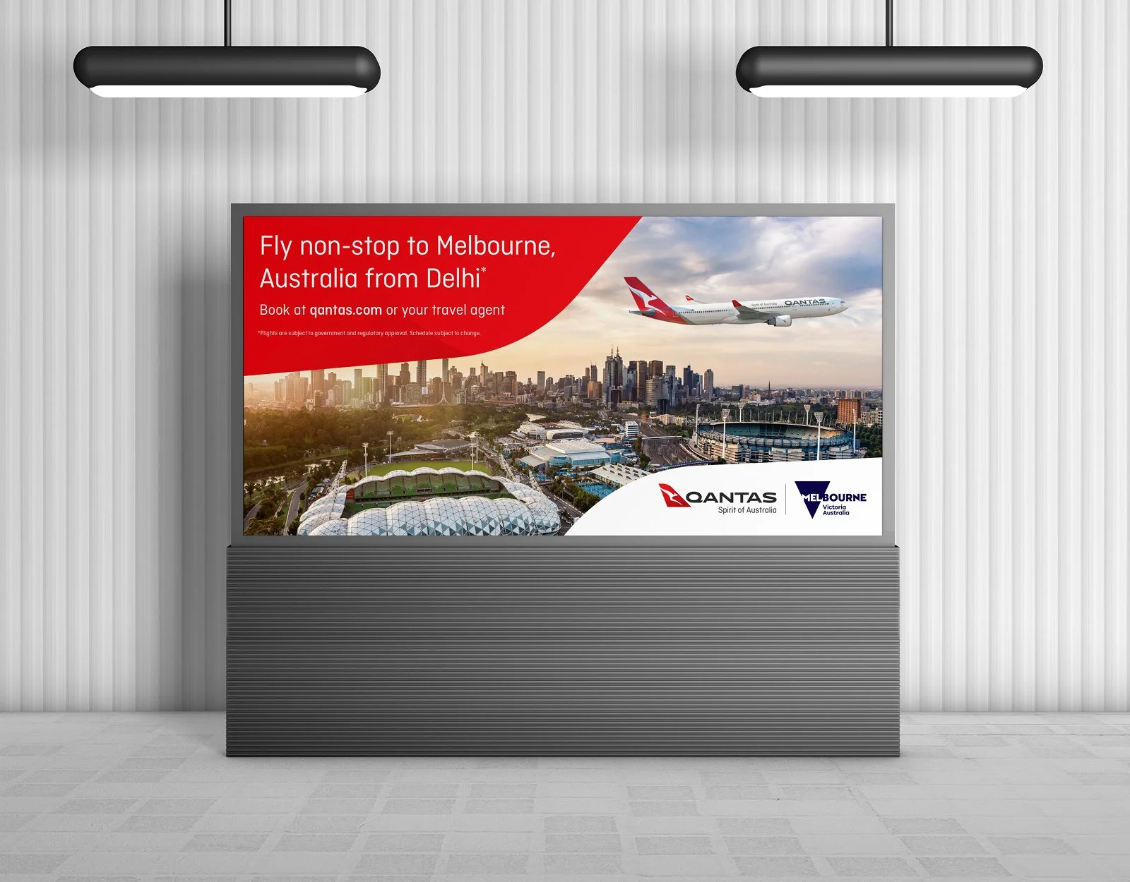
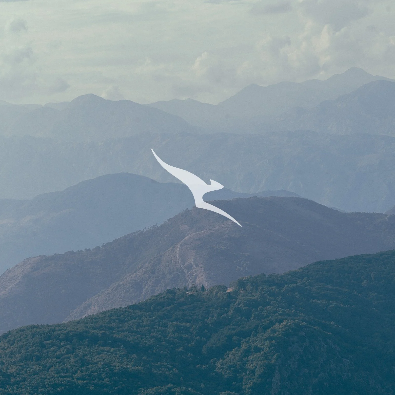
Qantas Group branding and creative for B2B and B2C, corporate communications along with everything from complex information design to global OOH Campaigns.
Brief
Maintaining the highest level of design aesthetic across this iconic Australian brand. “The Flying Kangaroo” as it is popularly called was originally named, Queensland and Northern Territory Aerial Services, it originally served Queensland and the Northern Territory. Qantas Airways Limited is the iconic carrier of Australia and the country’s largest airline and part of Australian pride and history.
Process
Manage multiple stakeholder relationships to deliver highly crafted design across numerous areas of the business from B2B to B2C and ATL. I have also been trusted in creating new brands under the Qantas group umbrella including Little Joey Club and Group Security.
Services
Creative. Design. Illustration. Finished Art.
An Australian restructuring specialist, turnaround and insolvency advisor. Registered administrators and liquidators with extensive experience in business recovery of all scales.
Helping many business owners through tough times over the years and providing solutions that work.
Brief
I was tasked with developing the branding and designing functional templates for ad campaigns, socials along with long copy formats like the ‘How to Thrive’ brochure.
Process
Based on the supplied logo guidelines I pushed the look and feel supplied into a design system that was usable for a mix of deliverables across print and digital.
Services
Art Direction. Illustration. Design. Finished Art.
Brief
Create a new identity, logo and stationery for the launch of a new agency specialising in revolutionising the ecommerce experience for companies to grow online. Show potential clients the core purpose of – help brands maximise their potential through online/e-commerce. Simplify the process, earn their trust and deliver results.
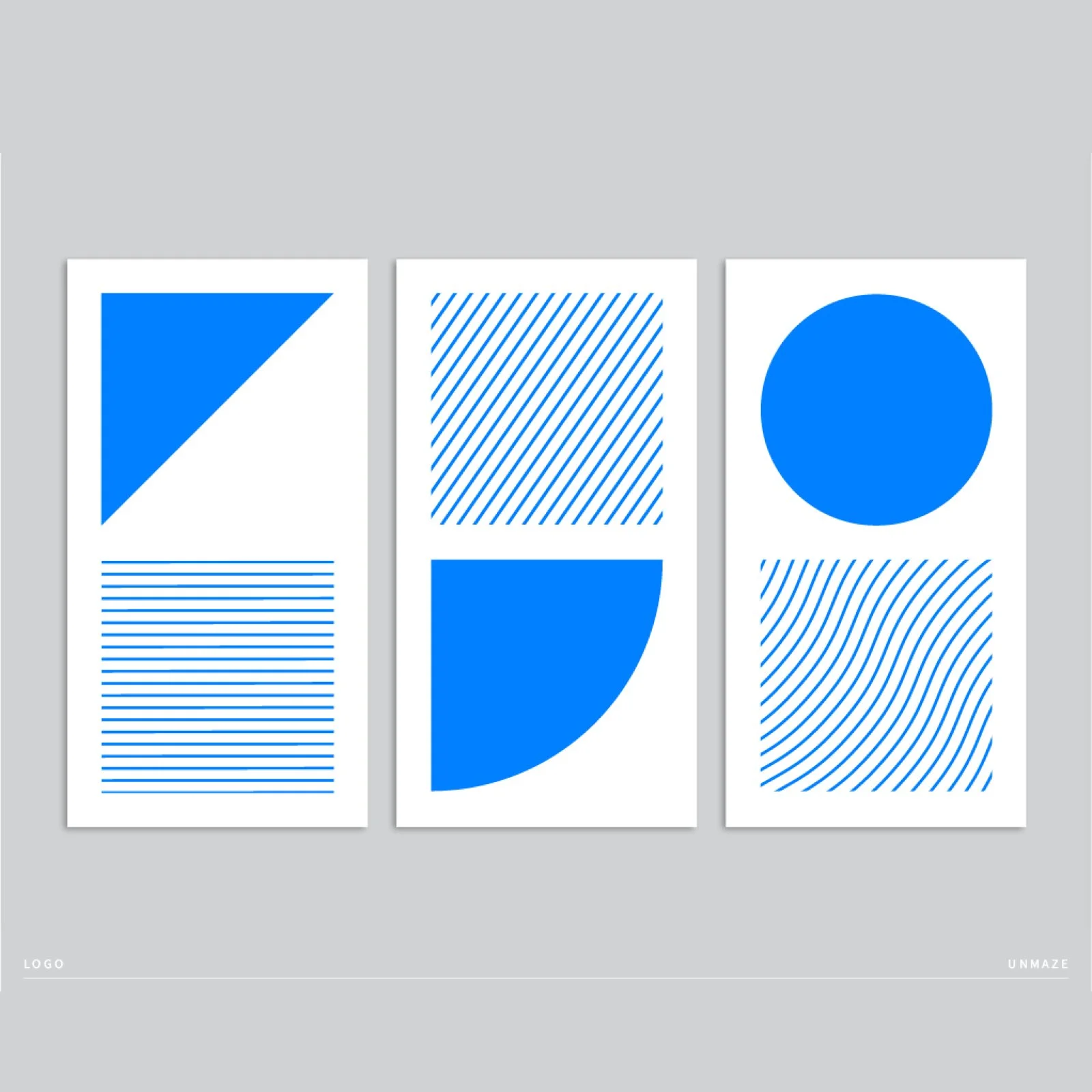
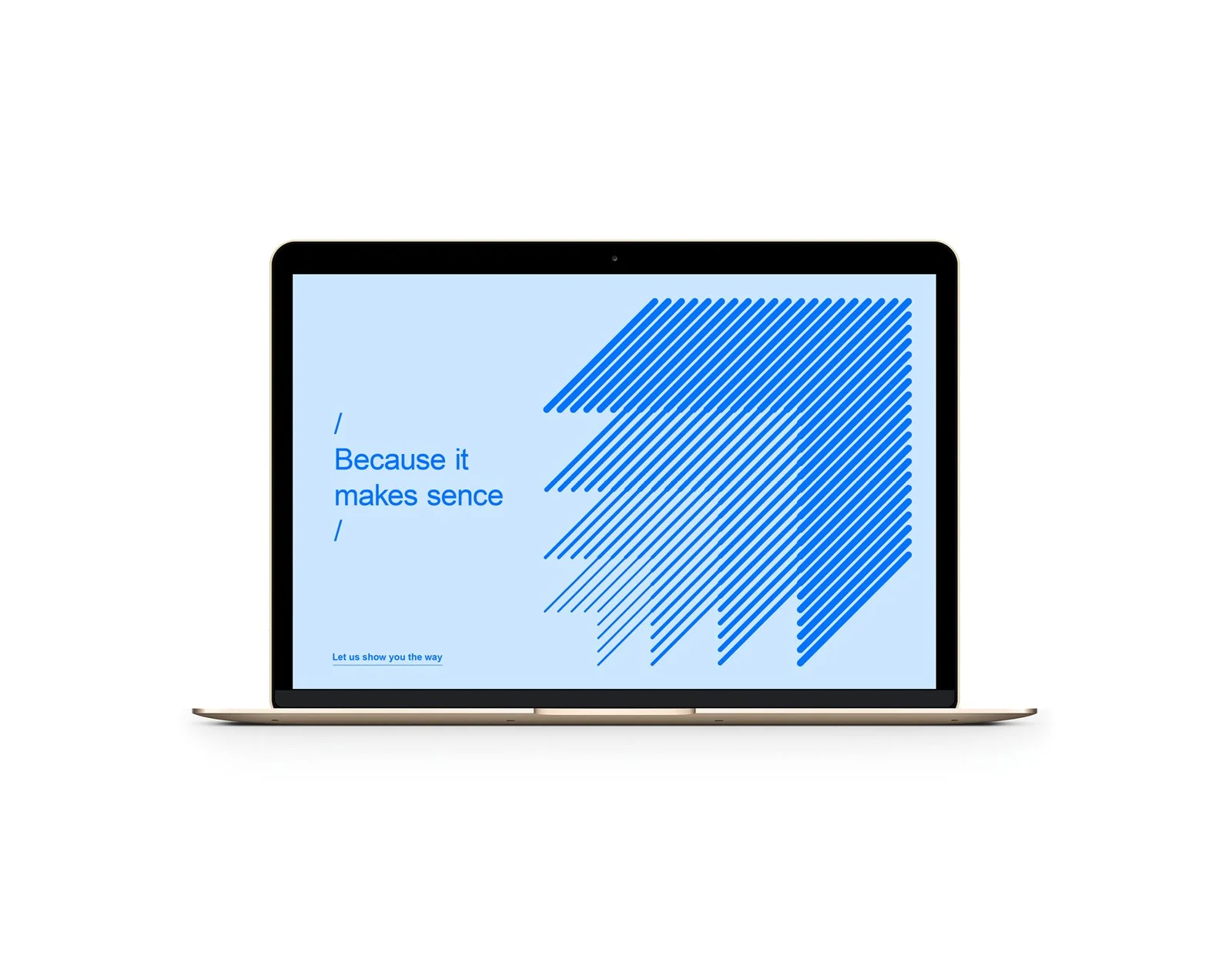
Process
Working closely with the founding director we developed this identity to bring it to the top of the market. This identity had to reflect the core values of the brand being trust, simplification, expertise.
The design was made to be simple, approachable and trusted. It has to be a trusted choice for both small business looking to set up online while also be a reliable option for larger companies looking for proven results and experience online.
Services
Art Direction. Illustration. Design. Finished Art.
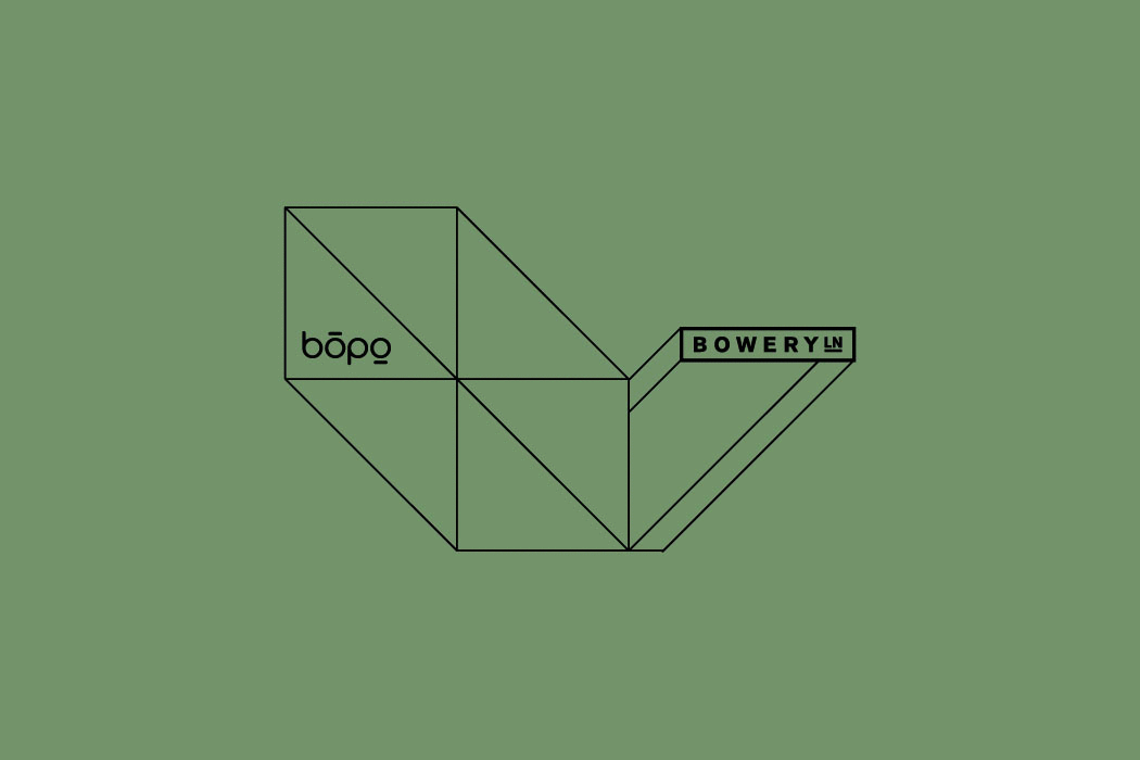
Brief
Create a new identity, logo, signage for a dynamic space where restaurant meets showroom, a social place where people can bond over a shared love of good food, wine and design.
Being a collaboration between ‘Bowery Lane, an upmarket city eatery, and The Porter, a boutique creative shared office space.
Process
Bring together influences from major sponsors of this venture including an upscale designer furniture company that would be supplying all furniture and give the space a unique look that would set it apart from the adjoining Bowery Lane eatery.
The design was made to be confidently simple yet beautifully crafted and constructed to give it a architectural aesthetic combined with a classy gallery that customers would want to see and be seen in.
Services
Art Direction. Illustration. Design. Finished Art.
Qantas Centenary Flight
Celebrating one hundred years after the first customer and bag of letters was flown across the Queensland outback, Qantas and Australia Post would follow the flightpath to recreate the historic airmail and passenger service from 1922.
To mark the historic event, family members of Qantas founders and guests with a connection to the early Queensland airmail services will travel on board QF6661 for celebratory occasion with the local communities who played a key role in the launch of the airline that is now our national carrier.
Brief
I was trusted in creating a logo mark for this historic event along with the event communication and collateral. Manage multiple stake holders in the decision making to make sure every part was how it should be in remembering where this part of aviation history started.
Process
As this was a very proud moment in the history of Australia, extensive research was carried out to make sure the history was preserved and included multiple old photography. The balance of the two partnering brands was also very important.
Services
Creative. Design. Illustration. Finished Art.
Brief
Create an identity for an internal staff cafe restaurant for the Australian head office of a global social media company.
Given the name ‘Sundays’ it had to look like an inviting place to visit that was a world away from the office desk. And a place for having fun while on a break but taking you out of the mindset of Monday to Friday. We needed a identity, logo, wall graphics, stationery look and feel for future stationery and packaging.
Process
Develop the idea of an iconic Sydney pastime of having Sunday brunch at a cafe. This identity was a fusion of a Sunday brunch with the life of a Summer festival. So I developed a bright and festive atmosphere that was full of colour and happy shapes.
Services
Art Direction. Illustration. Design. Finished Art.